
Learn how to adjust your button styles to design what you want. Create bold buttons, rounded buttons, and more. Several common button options can be added to your designs from the Buttons and CTAs section of the WordFly Design System.
Buttons with icons
Launching November 18, 2026.
The mini menu in the Button Text field contains several options for buttons, including the option to insert icons into buttons. You can upload your own images or choose from common button icons in the Add Icons menu: Ticket, Person, Arrow, and Chevron.
- Click into the Button Text field
- In the mini menu, click the Icons option on the right
-
Select an icon or click Upload/Browse Media to add your own
Icons will automatically adjust to the height of the text. - Adjust height and alt text, if needed
-
Go to Styles → Button → Image to adjust Spacing, Border, or Vertical Alignment
We find that 3px bottom padding works well for the Ticket, Person, Arrow, and Chevron icons.
Rounded or Square buttons

Create rounded corners by adjusting the Border Radius of any button. In WordFly starter emails, the default border-radius value is 3px.
Border Radius 5px rounds all corners
Border Radius 0 10px makes two corners square and two corners round
Border Radius 0px makes the corners square
- In Styles, go to Button > Background & Border > Border
-
Enter a pixel value for Border Radius

Rounded corners do not appear in Outlook PC, Outlook.com, and Yahoo webmail.
Buttons with bold text
- In Styles, go to Button > Font
-
Click in the Font Weight field to select 'bold' or type 'bold' into this field

Buttons with border outline

- In Styles, go to Button > Background & Border
-
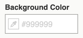
Set the Background Color to transparent or another color
-
Open the Border section
- Enter a pixel value for Border Width
- Enter a Border Style
- Enter a Border Color

-
Go to Button > Font
Update the Font Color to the same color as the border or a color of your choosing.
Make button text stay on one line
Some email clients (like Outlook) and web browsers like to wrap button text onto two lines. You can apply a no-wrap style to ensure your buttons stay on one line.
This option may cause rendering issues in Outlook PC with long button text pushing the right side of the design out. Keep your button text short to avoid this issue.
Buttons that stretch across the screen on mobile

-
Click the HTML tab in the lower-left corner
- In the HTML, use Ctrl+F and search for the second </style> tag in the HTML
-
Paste in the following code below directly below "width: 100% !important; }" and then exit the HTML view
div.button div { padding-left: 0 !important; padding-right: 0 !important; width: 100% !important; } - Go to Stylesheet > General Styles
-
Change toggle from Global to Mobile
You’ll know the mobile option is selected when you see the phone icons appear next to each style section. UI text will also turn blue and preview panel will switch to the mobile view.
-
Go to Button > Background & Border > Widths
In Rigid Width field, type 100%
-
Open the Spacing section
Adjust the left and right padding to 0px
Outlook PC may experience rendering issues from the Width %.