Adjust your columns to meet your design needs. Learn how to change the width of your columns, reverse stack on mobile, add padding, and scale on mobile.
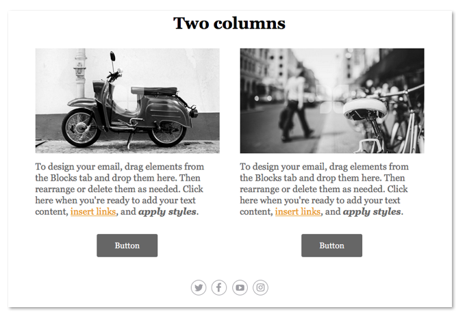
2- and 3-Column blocks
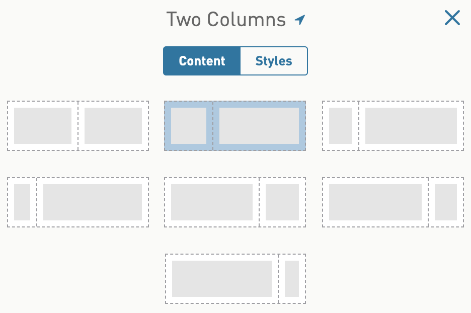
2-column and 3-column blocks are equally split by default. You can change the column width by selecting one of our column split options from the edit content panel of the column blocks.
4+ Columns block
Start with 4 columns, or use the slider to expand it up to 8 columns. All columns are always equal in width and can be used for link bars, sponsor logo quilts, and more.
Not seeing this block? Upgrade an existing email
Containers
Containers can be used in your designs to hold columns and blocks. They can also be placed inside columns to make it easier to apply padding to multiple blocks at a time. Containers add some additional control over background styling and can also help with hierarchy in the design.
Reversing column stacking on mobile
By default, on mobile all side-by-side blocks will stack left on top of right. For example, if you have a two-column block in the design, with an image and text block side-by-side, the natural stack on mobile will be the image block on top of the text block. You can reverse the stack of your columns on mobile so that right blocks stack on top of left. Follow these instructions to do this.
Step 1. Click the column block in your design
Step 2. In the left panel, check the box `Reverse on mobile`
Toggle the preview panel slider bar to the mobile preview and see how your columns are now stacked.
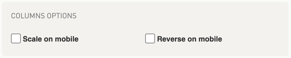
Scaling columns on mobile
By default, on mobile side-by-side content will stack left on top of right. For example, if you have a two-column block in the design, with an image and text block side-by-side, the natural stack on mobile will be the image block on top of the text block. You can opt to scale your side-by-side content so the blocks do not stack but instead scale on mobile.
Be sure to test how this looks on mobile. Scaling columns on mobile may make the content hard to read or take action on.
1. Click the column block in your design
2. In the left panel, tick “Scale on mobile” box
Toggle the preview panel slider bar to the mobile preview and see how your columns are not stacked on mobile now!
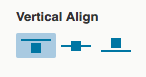
Vertically align columns
1. Click the column block in your design
2. Go to Styles > Column > Vertical Align
Set top, middle, or bottom alignment
Not seeing all of these options? You may need to upgrade your code
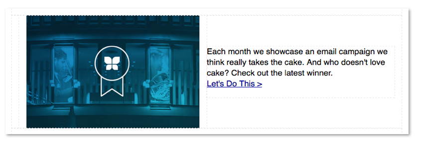
Creating padding between column sides
You can create custom padding between column sides in two or three column areas by using containers to hold your single or grouped blocks. By default new columns you add to your design do not have any padding between column sides which makes this solution really helpful.
Example of two-column area with padding between the two columns
Follow these instructions to create this type of padding with a container in your columns:
1. Click the column block in your design
2. Pull a single block into one of the column sides, such as an image block
3. Pull a container structural block below the image block on the same column side
4. Drag your image block into the container
5. Drag any other blocks into the container below your image block, re-arrange your blocks in this container
6. Hover over your container in the column and click on the title 'container'
This will open the edit content window on the left side of the editor for this container.
7. Select the STYLES tab for the container
8. Adjust your padding on the middle side of the container, e.g., insert 10px to the right padding
9. Toggle your container STYLE tab to mobile and adjust the padding to 0px
Do this step if this column will adjust on mobile to one-column. Removing the padding will ensure this container matches the padding of other blocks on mobile. Skip this step if you plan on scaling your column on mobile.
Once you’ve set the style on the container in one side of the column you can hover over the container, right-click on it and select duplicate. Then drag this container to the other side of your column. Go through the steps above to make similar edits to the other side of the container (remove the padding on the right and adjust it on the left instead).
With your padding set on both sides of the column (or in three columns) using a container, you can hover over the column and right-click on it and select duplicate to repeat the entire block multiple times in your email.