What sizes are the image areas?
Image sizes vary depending on the space the image is placed in. There are no fixed sizes. Image blocks in the editor will accept any image uploaded into the space. This makes image areas very flexible.
- You can upload an image of any width
- You can upload an image of any height
- Image widths and heights should match if you want to align images side-by-side in columns
General dimensions guidance
| BLOCK TYPE | GENERAL WIDTH | HEIGHT |
| Banner or Feature images | 800px – 1200px | Any height |
| Two-Column images | 480px – 600px | Any height |
| Three-Column images | 480px – 600px | Any height |
- An image that is larger than the area you are uploading it to will look more crisp on any device that loads the design. As a general guideline, use 800px-1200px width for your largest images. Feel free to adjust for smaller image areas.
- You can upload images that are smaller in height than the default space. WordFly will adjust the size of the image to fit the space you are uploading it to.
- When you want side-by-side images in column blocks to align, make sure the image width and heights match before uploading the images into the space.
Image size guidance
| Individual image sizes | Aim for no larger than 200 KB each |
| Animations and large hero images | Aim for no larger than 1 MB |
After uploading, non-animated images can be optimized by clicking Edit Image and resaving
To restrict the largest width of an image
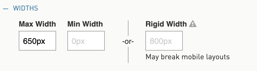
You can set a Max Width for an image. The image will vary in size but it will never get wider than this width.
Step 1. Click on the Image
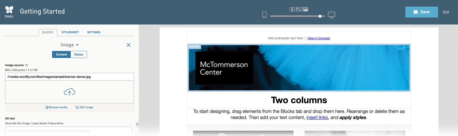
Step 2. Click on Styles to edit styles for This Block

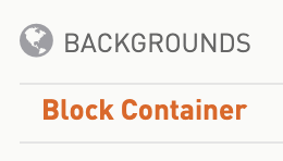
Step 3. Open the Block Container
Step 4. In the Widths area, enter a Max Width
To maintain the exact dimensions of an image
Option 1
Upload images into Text blocks instead of Image blocks.
Take note: Images uploaded into Text blocks are always fixed width by default and not responsive.
Step 1. Click on a Text block
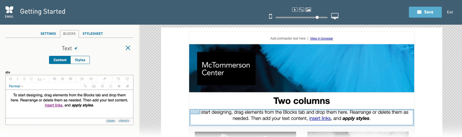
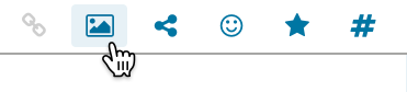
Step 2. Place your cursor in the Text area where you would like the image to go. Click on the Add Image icon.
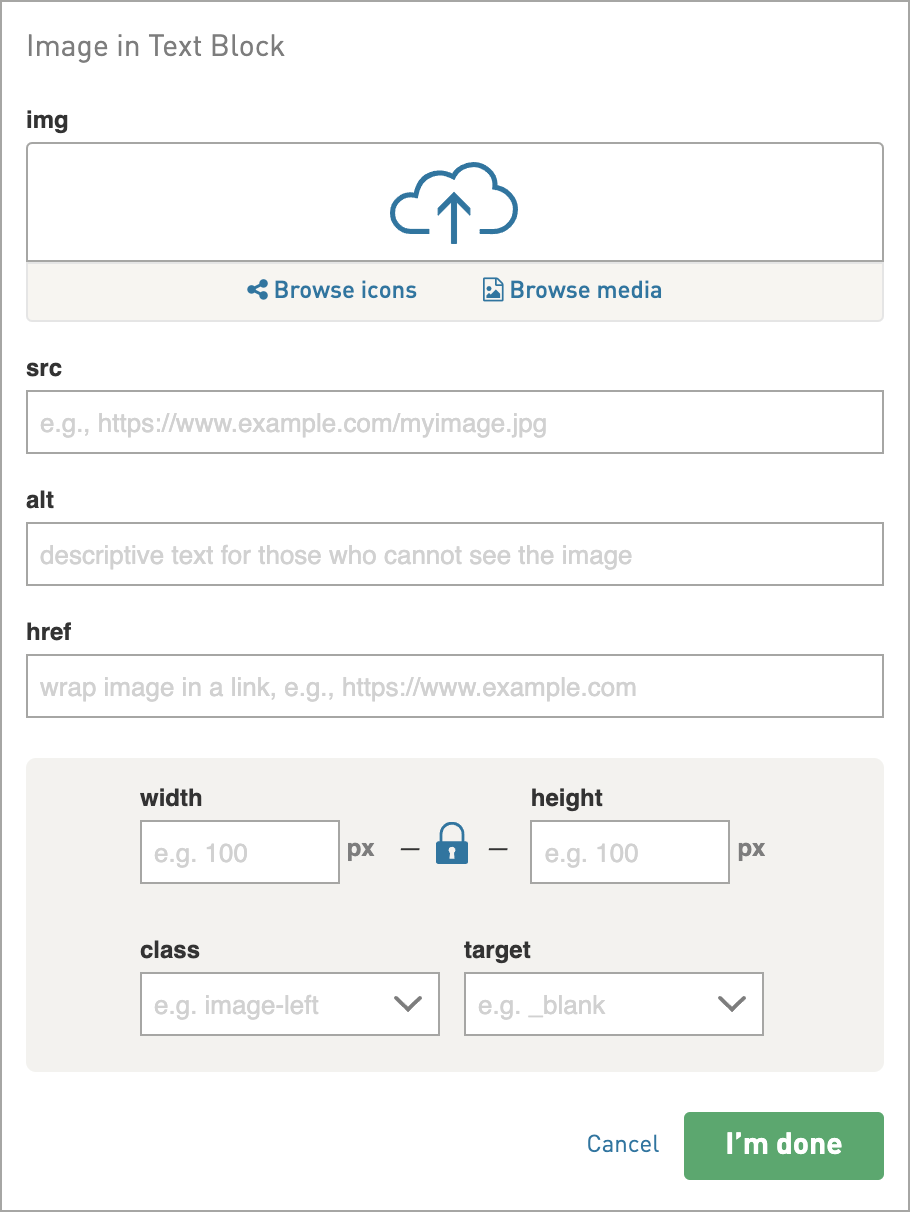
Step 3. Paste in the image URL in the src field —or— click Media to upload or select an image. Click I’m Done.
Option 2
Remove the full-width class for images when you want your image to stay the uploaded size, regardless of the design’s responsive changes.
Step 1. Click on your image
Step 2. Open the More Options section. Remove `full-width` in the Class field.

Uploading retina images
The latest Apple devices use retina displays. This means that twice the amount of pixels are packed into one image in order to make it look more crisp and lifelike. A retina image requires uploading an image that is twice the size of the space it is occupying.
In an Image block
Upload an image that is at least twice the width dimensions. For example, if the image is being uploaded into an 800px wide space, upload an image that is 1600px wide. WordFly will resize it for this space and the extra pixels will make it look crisp on retina displays.
In a Text block
Click the Add Image icon. Select your image from the Browse Media link or insert your image URL directly into the src field. WordFly will automatically insert the width and height of the image. Adjust the settings for width and height to half. Click I’m Done. The image will be inserted at exactly the size specified. Double-click on the image to go back to the edit window.
Take note:
- Images uploaded into Text blocks are always fixed width by default and not responsive.
- Uploading an image that is double the size of the area means the device opening the design will require more bandwidth to download the image. This means more data usage on mobile devices and could result in slower image download. Take this into consideration when uploading retina images.