WordFly RSVP and Survey Pages use form blocks to collect information and submit responses.
Form blocks basics
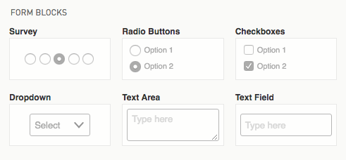
- The RSVP and Survey Page can have unlimited form blocks added to the design. Add checkboxes, radio buttons, dropdowns, and open text areas.
- Any form block can be marked as required. When marked, the respondent must complete the form before submitting the page.
- All form blocks have an Additional Note field for adding a note below the Question field.
- Modify design styles from Stylesheet > General Styles or All Blocks to carry styles through to the confirmation pages.
Required elements
-
RSVP Yes and No block
Required for RSVP Pages, for either a Yes or No response. It is not meant to be deleted, duplicated, replaced with new buttons, or moved into a new column or container. -
Submit block
Required for submitting RSVP and Survey Pages in order to collect page results. -
Captcha block
RSVP and Survey Pages both have captcha blocks. reCaptcha is a service from Google that helps protect our Pages from spam and abuse. The captcha form will ask the user more questions the more suspicious it is.
These blocks cannot be deleted, but you can move them to a new location on the form if needed, and you can use styles to customize the design.
If you move the required blocks into another container (such as a two-column or other structural block), that container cannot be deleted. You would need to move the required blocks out of the container to be able to delete the container.
Checkboxes block

Checkbox form blocks let you set up a list of choices where there may be multiple options to select for the answer. The choices are not mutually exclusive.
In the open Answers field where you see "option 1, option 2, option 3", you can edit these options to your selections and add new options by hitting enter (return) on your keyboard to type in the next option.
You can display checkbox options in 2- or 3-columns using the checkbox options on the left side.

To update the height globally for checkbox answers
1. Go to the Stylesheet tab
2. Open Form Blocks
3. Select Checkboxes
4. Open the Checkbox element
5. Open Adjust spacing and adjust margin
To update the height individually for checkbox answers
1. Select the Form block in your design
2. Click on Styles (this will default to This block)
3. Select the Checkbox element
4. Open Adjust spacing and adjust margin
Dropdown block

Dropdown form blocks let you set up a list of choices where there is only one answer to select. The choices are exclusive; when a value is selected, any previously selected list value is no longer selected. The answer will display in the dropdown placeholder once selected.
Radio Buttons block

Radio form blocks let you set up a list of choices where there is only one answer to select. The choices are exclusive; when a radio button is selected, any previously selected radio button becomes deselected.
In the open Answers field where you see "option 1, option 2, option 3", you can edit these options to your selections and add new options by hitting enter (return) on your keyboard to type in the next option.
You can display radio options in 2- or 3-columns using the checkbox options on the left side.
*Not seeing this option? You might need to update your Page code.
To update the height for all radio buttons
1. Go to the Stylesheet tab
2. Open Form Blocks
3. Select Radio Buttons
4. Open the Radio button element
5. Open Adjust spacing and adjust margin
To update the height for an individual radio buttons block
1. Select the Form block in your page
2. Click Styles (this will default to This block)
3. Select the Radio Button element
4. Open Adjust spacing and adjust margin
RSVP block
RSVP Page Yes / No buttons can only be changed from the preview panel. Click on the RSVP block to access the edit content panel on the left side where you can make changes to the block styles.
To update RSVP Page Yes / No buttons
1. Click on the RSVP block in your page

2. Click the Styles tab in the left panel

3. Modify the styles for the Yes / No Button elements
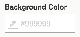
To update RSVP Page Yes / No buttons check mark background
The RSVP Yes/No button check mark (selected state) is white. Use another background color to change the color; for example, gray or black or another appropriate color.
1. Click on the RSVP block in your page
2. Click the Styles tab in the left panel
3. Select the Yes/No Buttons Checked element

4. Select a Background color
Submit Button block
The Submit Button form block style uses separate styles than single button blocks. You can edit your Submit Button form block styles in the main Stylesheet.

To update Submit Button form block style
1. Go to Stylesheet > Form Blocks

2. Select the Submit Button form block

3. Modify the styles here to update all Submit buttons
Survey block

Survey form blocks are set to 5 answers by default. Use the Add button to add up to 6 more options. Toggle answer formats to Disagree-Agree or 1-5. Use the Box style checkbox to change from a radio button to a box format. Edit the answer fields to your desired information by typing in anything else you prefer. You must include a label for each answer option in order for Page Results to collect appropriately. Respondents may select only one answer.
- Net Promoter score uses a scale of 0-10. Use the Add button to add up to 11 options.
- Consider how your survey block will display on mobile. More than 5 answers on mobile will be a tight fit.
* Not seeing the Add button and Box Style? You might need to update your Page code.
Text Area block

Text area form blocks have a maxlength setting. Set this to the highest character length you will allow. Each character is equal to 1. For example, if you allow 250 characters this includes any spaces and punctuation.
Text Field block

Text field form blocks collect different types of data that must be typed into the open text field. Data includes dates, email, number, phone, text, time or a URL. Each field has its own built-in validation. Set a field to required or not. (Optional) On select fields write a regular expression for the data validation.
Select from 7 text field types:
- Date: Show a date picker. Use-case, collect a birthday date.
- Email: Collect an email address.
- Number: Open text field for a number value.
- Phone: Open text field for a phone number. Use-case, collect a home or mobile contact number.
- Text: Collect text. Use-case, best for short text. Use a Text area form block for longer areas of text.
- Time: Show a time picker. Use-case, collect the best time for a follow up call.
- URL: Collect a URL.
Date and time text field form blocks aren't supported everywhere and will display as open text fields in these cases. Use maxlength to set a limit on how much text can be added and use placeholder or question text to show the format requested. For example, if asking for a date, show a preferred date format as the placeholder text (Ex, mm/dd/yyyy). If you want to collect a date that is just a month, use Text Field Form > Type > Text. Enter Month in the Placeholder field and set a maxlength.
Regular Expression Patterns
(Optional) You can write a regular expression pattern to ensure accuracy for some of the fields. Example, write a regular expression for email type to check that the email contains a valid top-level domain and no spaces in the address portion. Or, write a regular expression to make sure a phone number contains dashes.
Maxlength
Set maxlength to the highest character length you will allow a user to input. Each character is equal to 1. For example, if you allow 250 characters this includes any spaces and punctuation.